Tom over at WellUrban has been posting some interest articles on statistics from the recently released 2006 Census. As you would expect, his focus has been on Wellington and his last post was on the age structure of our city and the 4 other cities that make up the Wellington region.
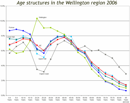
Wellington itself seems to be exactly opposite the other regional cities as well as the NZ average in terms of age structure. Put bluntly, we have few very young or very old persons, and a great proportion of 20 to 40 year olds. As usual the easiest way to see and understand this is to visualise in the form of graph as Tom has done – the lime green is Wellington City (click through and read the full article):