Web Category Archive


June 23rd, 2009

Introducing AcornHq

A couple of months ago I left my position at Ponoko, handing over to the highly capable Josh (aka Mr Judkins). It was quite emotional leaving Ponoko, *sniff*. We were in Argentina at the time and Sarah suggested it would be a good idea to take a couple of months off once we got to London.

“And do what exactly?” I said.

“Whatever you want!” came the rather apt reply…

I got to chew on that chestnut while we continued traveling around Argie. The two big reaffirmations for were: 1) I love the web, still… and 2) I love to create. Then I had an idea I knew I wanted to work on followed by another and another.

So here’s the first, AcornHq:

acornhq-s.jpg

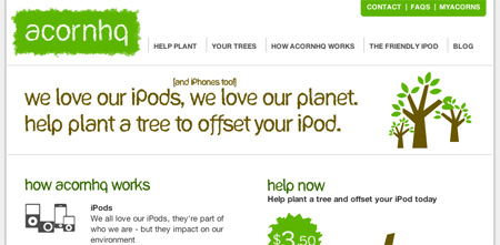
AcornHq is, in a sentence, a carbon offset site for iPod and iPhone users.

At the very core the idea was to promote more environmentally responsible gadget ownership. To start with this means we provide an easy way for people to offset the carbon associated with their iPod or iPhone.

We all love our iPods and iPhones but they do have a very real cost to the environment. Carbon is emitted when your iPod is manufactured, when your iPod is transported from the factory to you, and when you use power to recharge your iPod. How that power is generated to recharge your iPod also has a huge impact. Think hydro vs. coal…

So you come to AcornHq and join a tree by purchasing a leaf, for US$3.50. Once all the leaves on that tree have been taken, we plant a tree in the South Island to offset those iPods. Trees being most excellent at extracting and absorbing atmospheric carbon dioxide.

You can then place your tree on your website and watch it fill up with leaves as more people join it. Also, when the trees we plant reach the end of their life, the plan is for any timber produced by the trees to go into community housing projects.

This is just the start and I’m quite excited about everything else to follow but do have a look and let me know what you think!

A big public thank you to my lovely wifey for helping me wrap my brain around this idea and asking the hard but essential questions. Thanks to Olmec Sinclair too for his hard work which has ultimately allowed me to realise this idea.

This is the first of (what I hope will be) three or four wee projects you’ll see from me in the next couple of months.

P.S. Argentina has to be one of the most insanely great countries in the world, you really should go visit. It’s a total Lovemark for me - hope to go back to live one day.

Posted in: Web, Environment, Work, Apple

March 5th, 2009

Web 2.0 presso breaks the 100k mark

About two years ago, Intergen, gave me an opportunity to create a Web 2.0 focused presentation:

I presented it in Auckland, Wellington, & Christchurch as part of Intergen’s Twilight seminars as well as a Brightstar conference in Auckland. It was a lot of fun and I thoroughly enjoyed it.

I uploaded the slides to Slideshare to create an easy way to share them around. I noticed after a few weeks it was getting a consistent amount of views - something that has continued for 2 years now having just now recorded it’s 100,000th view!

I think it’s probably the most popular piece of media I’ve personally produced. Next goal: 1,000,000!

Posted in: Web, Presentations, Work

September 23rd, 2008

Death of a sign up form

Sign up forms really do need to die. And yet its such an ingrained part of our thinking and practice with websites, both as users and as webbies. This certainly isn’t a new topic but it’s a great one to think about because it can have such a huge impact on our users’ experience.

One of the better articles you can read on this subject is an excerpt posted on A List Apart from LukeW’s semi-recent book: Web Form Design: Filling in the Blanks. I have to quote the opening paragraph:

I’ll just come out and say this: sign-up forms must die. [You’ve] stumbled upon or been recommended to a web service. You arrive eager to dive in and start engaging and what’s the first thing that greets you? A form.

The simple question is why does your service need to know information like your birthday or last name to allow you to post a video or start a blog or to play a game or whatever? Why not allow your users to get stuck in, see the value of using your service, and only ask for the info when it is needed to advance the task or experience?

One of the best examples I’ve seen of this recently was Posterous. Consider their homepage:

posterous-grab.jpg

I love the: “Skip it! No setup or signup”. Posterous is seriously cool - it can even tie in with your blog to make it super simple to email anything to your blog. Give it a go now, just email: post@posterous.com

As soon as you start thinking about how gradual engagement could work for your service you’ll start to feel like you’ve been freed from some kind of web-oppressor. We’re working on something really neat at Ponoko (launch is very close) following these rules. I can’t wait.

A big thanks to Jeffrey for helping make me passionate about the use and abuse of forms.

Posted in: Web, Design, Work

September 11th, 2008

Lifting your laptop in style

laptop-stand.jpg

I was surprised and chuffed to see my groovy Stiletto Laptop Stand get a quick review on CNet by Michelle Thatcher:

It’s bad enough that my vacation’s over, but the sudden withdrawal of natural materials is really bringing me down. Which is why the wooden Stiletto laptop stand spoke to me…

The basic design idea, or brief, came from my father who wanted some laptop stands for his mobile computer suite. We spent the better part of a weekend designing and cutting out prototypes (5 in total) before we arrived at the finished and perfected result.

It’s another great example of what’s possible with Ponoko. Not only can we help you create a truly original and personal piece but we can help expose it to the rest of the world. Brilliant.

I can’t work without mine now and I’m slowly converting the others in the office. If anyone would like one of these stands, let me know, I’ll give you a special Umamiblog discount. :)

Update:  And another quick review on PopGadget - “The Stiletto is a laptop stand with style”

Posted in: Web, Design, Work

August 20th, 2008

T-shirt t-short: Itself review

Imagine it’s lunch-time. You’re sitting at your desk stuffing your face with some kind of nutrition-less processed snack and you think to yourself: “Ooh, I better check my bank balance”.

Trawling through your credit card transactions, buried between Hell Pizza and numerous iTunes charges, you see:

80000 TANITIM ILETISIM ISTANBUL (27.06 Turkish Lira)

Simultaneous thoughts of “Oh crap” & “WTF!?” rush through your brain. Followed immediately by: “How’d they get my credit card? I better ring the bank, reverse the charge, and get a new card…”

itself.gifThen suddenly you remember. Could TANITIM ILETISIM ISTANBUL be Itself, that cute t-shirt site you bought a t-shirt from last week? A quick email to their support team answered my question in the positive. Phew.

The review:

itself-grab.jpg

The good
Itself is a well designed site that is clean and visually appealing. The checkout process is easy to complete and they’ve definitely thought about most of the interactions users are going to have with them and worked to make them simple. Given how much Threadless has led the charge in this area it’s not surprising to see others follow.

I do like the t-shirts they offer and the fact they’ve limited it to only a handful of designs. Itself’s shipping costs to NZ were quite reasonable and they definitely out perform Threadless when it comes to packaging - beautiful in comparison. Their comms and support are also very good - for instance they don’t charge you until your t-shirt has been shipped.

The bad
The whole credit card charging scenario I went through above is a major let down for Itself. I felt they weren’t upfront about being a Turkish company or what I could expect to see on my credit card bill. I just don’t understand why companies don’t charge with their brand name!?

It’s not an issue about Itself being Turkish, the problem is purely that my expectations are that when I order a t-shirt in US Dollars from a .com English language website, then I’m going to expect to see a US-based charge. Not an Istanbul charge in Turkish Lira with a name I don’t recognise! Seriously Itself has no idea how close they came to having the transaction reversed/canceled.

The t-shirts themselves are ok - but they’re the kind of t-shirts that only look good on people who go to the gym. A lot. (If you’re one of those people then this won’t be a bad thing…) This is purely a style call. :)

Here’s the actual t-shirt I bought. Love the simplicity quote so had to have the tee:

itself-tee.gif

Wee note: Part of the reason I’m posting this is in case anyone else has the same freak-out when seeing their credit card and Google’s the charge name. If that’s you, do leave a comment…

Posted in: Web, Rants, Design

May 5th, 2008

Woah Mozy, WTF?

When I still worked at Intergen, Trey put me onto Mozy. It’s an insanely-great online backup tool. It works on a PC or a Mac, it works in the background with minimal fuss, keeps the different versions of your files, is very lightweight, and has a very generous free account.

I love it. It has saved my bacon while I’ve been working on Ponoko more than a couple of times.

Today, as a Mozy user, I received their May newsletter (don’t think we’ve seen one at all before…). A big part of my role at Ponoko is email marketing so I pay a lot of attention to what others are doing. Below is the “lead” story in their newsletter:

ftw.jpg

First thought: WTF was he thinking!? I’m almost speechless beyond that…

It has nothing to do with their product (which is awesome) and manages to insult Americans, Canadians, Quebecois, hockey supporters, and probably his staff as well.

Then again, had he not insulted all those people I could probably guarantee I wouldn’t be blogging about his newsletter or his company or his product.

What do you think? Insanely stupid or insanely smart?

Posted in: Web, Advertising, Rants

April 30th, 2008

Social media is like a money making machine

munee-musheene.jpg At least in this analogy it is.

JD has posted some good commentary on Facebook’s $15billion “valuation”. And as usual he couldn’t be more wrong for the most part I agree.

However, I can’t help but think we would have said the same of TradeMe’s eventual valuation of $700-and-something million. To me it means we should really look at the other side of the equation and just consider: “what if?”

At $15billion, Facebook’s 240million users would be worth $62.50 each. Now if you have an average profit per user of $6.25 per year then maybe the $15billion “valuation” is more or less valid (at least for the purposes of this article).

The obvious observation is, of course, there ain’t no way Facebook is earning a profit of $6.25 per user right now or anytime soon. JD rightly points out that even “Google’s latest conference call included hints that they were having trouble monetizing social traffic” and I think it’s not hard to agree with that point for the whole social media/networking/traffic kit and caboodle.

Which leads to my title and analogy:

Social media is like a money making machine. Only we’re all too stupid to figure out how it works. We can recognise that a lot of smarts, effort, and thought went into building these networks. We know the output is money. We just don’t know how to do that tiny little bit in the middle.

I eagerly await what happens next.

Posted in: Web, Work

March 6th, 2008

‘Stocked

I never managed to get around to a timely update of the fun I had Webstock. It was, as I’d hoped, a most excellent, inspiring, re-energising and fun conference – just like the first. The crew behind Webstock managed something that isn’t as common as we hope it to be in NZ.. which was to prove it wasn’t a fluke and pull it off for a second time. Well done guys, it’s no easy feat.

My highlights from the conference:

  • As I said before Webstock, I couldn’t wait to see Kathy Sierra again. While she did have a hard act to follow, thanks to Damian Conway, it was great to hear her talk again about creating passionate users. Our apps do have aspergers and I’ve been thinking ever since how to include a WTF button in Ponoko. Nobody is passionate about something they suck at.
  • Michael Lopp’s presentations on managing design and primal software development were great. Key takeaway for me was the “pony meeting”. Enjoyed talking shit about the iPhone outside Vintage with him at 2am too…
  • Damian Conway was freaking awesome, if you only watch one Webstock video (when they are uploaded) it should be this one.
  • Tom Coates – “Twitter is a service that displays error messages on the Internet”, “You can never have too much data”.
  • Kelly Goto’s getting unstuck was incredibly thought provoking.

My feedback for the conference is fairly similar to some other bits I’ve seen around the place. A ponder at why LukeW and Michael Lopp or Amy Hoy and Dan Cederholm were streamed while Molly Holzschlag wasn’t. No need to mention the Wifi either ;)

Only two more years till the next one, or is it?

Posted in: Webstock08, Work

February 14th, 2008

Webstock WiFi-cked

Thanks to the ubiquity of things like iPhones and iPod Touchies all trying to connect to the WiFi as well as the usual laptops has meant no internet access for me since my first post this morning. I have been taking notes so the speeches from the afternoon will make it on here… eventually. Some of them were awesome!

Here’s a rather enterprising way a person let others now how he/she felt about the WiFi, cute:

wifi.jpg

Posted in: Webstock08

February 14th, 2008

Webstock Thursday AM

Whoops. Got here way too late this morning and missed the welcome speech plus the first 20 mins of Nat Torkington’s speech. The goodie bag looks great and things around the conference hall look similar to 2006.

Nat Torkington
Nat presented well and only had minor hickups with his presentation with font issues that meant lot of text didn’t make it onto the slides. But he did really well dealing with it and probably had better audience attention because of it.

Nat talked about designing for the future using analogies from Victorian-era England. Strong messages were on measuring, gathering, and analysing data, then acting on it. The key trends he talked about were:

Growth
Growth in computing power just gets soaked up. We will use any addition power we create.

Media
Newspapers are dead and TV is starting to realise they have no control over their content. Journalism on the web (not citizen journalism) and what we’re seeing (more on the data message).

Immediacy
Users expect immediacy. Design for mobile devices! Ubiquity BUT they can be walled gardens.

People
They may be lazy and irrational but learn how they will act and react. Read Mind Hacks by Tim Stafford. Important notes: people focus on short-term gain, fairness, and the thrill of overcoming a challenge for the first time (hedonic adaption). We also overestimate our confidence.

Reality-based
Gather info. Admit you were right/wrong. Act based on the data.

Thoroughly enjoyable speech and a great session to start the conference.

Molly Holzschlag
Molly talked on why web standards aren’t. It was a good presentation on web standards but may have been a bit too focused for the whole audience. Slide design wasn’t necessarily poor but could be improved. Some really good questions were asked such as “have we failed on the ideology or has the ideology failed us?” “Is it standards vs. best practice or standards vs. interoperability?”. Molly has been working with web standards for 10 years!

Shawn Henry
Shawn spoke on making your website shine with accessibility. This was a tough ask with me because I don’t think anyone could beat Darren Fittler’s presso in 06. She used some great examples of people using mouth-sticks to type, or just their thumb. How is their experience compared to you assumptions on how people should use your site? The screen reader demo was good but it doesn’t top watching a blind Darren Fittler use it. Shawn finished with a good call to action - fight the good fight with accessibility.

Posted in: Webstock08

February 13th, 2008

Coding for freedom, again?

Webstock 08Hands up who’s heading to Webstock this year? Cool! I’ll see you there.

I’ve been looking forward to Webstock for a long time now and I still question their decision to hold it every two years. But the wait is over and tomorrow the conference proper starts and then wraps up on Friday evening. Sibylle has already attended one of the workshops and she got to show off her goodie bag at work yesterday. They look insanely cool!

I think I’m most looking forward to Kathy Sierra, she was f…ing brilliant last time and I guess I’m not expecting anything less. She is breaking her “silence” at Webstock too. I feel quite honored she chose Webstock to do so.

Last time I tried my best at live-blogging the event and got quite a good response for it. I’ll see how it goes but there is a good chance you’ll see a dozen posts on this neglected blog for the next couple of days. ;)

P.S. I’m still perplexed by that slogan. Are we really coding for freedom?

Posted in: Webstock08

November 7th, 2007

Channeling TUANZ

tuanz1.gif The TUANZ Business Internet Awards are on tonight and I have the pleasure (?) of seeing two sites I’ve worked on reach finalist stage.

The DoC site is a finalist in the Information Architecture category and Ponoko (with Origin) are finalists in the User Generated Content category.

Poor old Sal (who, funnily enough, also worked on DoC) had an unmovable appointment with our public health care system yesterday. So it was up to Jase and myself to try and convince the 5 judges we are the generalissimos of the user-generated content generation. We’ll know later tonight if we were successful… wish me luck.

Update: We didn’t win our category but we did pick up the Craft Award!

tuanz_blog.jpg

Posted in: Web, Presentations, Design, Work