Umamiblog

written by john lewis

Design Category Archive


Death of a sign up form

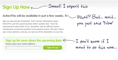
Sign up forms really do need to die. And yet its such an ingrained part of our thinking and practice with websites, both as users and as webbies. This certainly isn’t a new topic but it’s a great one to think about because it can have such a huge impact on our users’ experience.

One of the better articles you can read on this subject is an excerpt posted on A List Apart from LukeW’s semi-recent book: Web Form Design: Filling in the Blanks. I have to quote the opening paragraph:

I’ll just come out and say this: sign-up forms must die. [You've] stumbled upon or been recommended to a web service. You arrive eager to dive in and start engaging and what’s the first thing that greets you? A form.

The simple question is why does your service need to know information like your birthday or last name to allow you to post a video or start a blog or to play a game or whatever? Why not allow your users to get stuck in, see the value of using your service, and only ask for the info when it is needed to advance the task or experience?

One of the best examples I’ve seen of this recently was Posterous. Consider their homepage:

posterous-grab.jpg

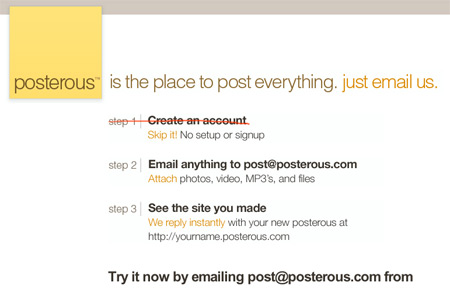
I love the: “Skip it! No setup or signup”. Posterous is seriously cool – it can even tie in with your blog to make it super simple to email anything to your blog. Give it a go now, just email: post@posterous.com

As soon as you start thinking about how gradual engagement could work for your service you’ll start to feel like you’ve been freed from some kind of web-oppressor. We’re working on something really neat at Ponoko (launch is very close) following these rules. I can’t wait.

A big thanks to Jeffrey for helping make me passionate about the use and abuse of forms.

Posted in: Design, Web, Work

Lifting your laptop in style

laptop-stand.jpg

I was surprised and chuffed to see my groovy Stiletto Laptop Stand get a quick review on CNet by Michelle Thatcher:

It’s bad enough that my vacation’s over, but the sudden withdrawal of natural materials is really bringing me down. Which is why the wooden Stiletto laptop stand spoke to me…

The basic design idea, or brief, came from my father who wanted some laptop stands for his mobile computer suite. We spent the better part of a weekend designing and cutting out prototypes (5 in total) before we arrived at the finished and perfected result.

It’s another great example of what’s possible with Ponoko. Not only can we help you create a truly original and personal piece but we can help expose it to the rest of the world. Brilliant.

I can’t work without mine now and I’m slowly converting the others in the office. If anyone would like one of these stands, let me know, I’ll give you a special Umamiblog discount. :)

Update:  And another quick review on PopGadget – “The Stiletto is a laptop stand with style”

Posted in: Design, Web, Work

T-shirt t-short: Itself review

Imagine it’s lunch-time. You’re sitting at your desk stuffing your face with some kind of nutrition-less processed snack and you think to yourself: “Ooh, I better check my bank balance”.

Trawling through your credit card transactions, buried between Hell Pizza and numerous iTunes charges, you see:

80000 TANITIM ILETISIM ISTANBUL (27.06 Turkish Lira)

Simultaneous thoughts of “Oh crap” & “WTF!?” rush through your brain. Followed immediately by: “How’d they get my credit card? I better ring the bank, reverse the charge, and get a new card…”

itself.gifThen suddenly you remember. Could TANITIM ILETISIM ISTANBUL be Itself, that cute t-shirt site you bought a t-shirt from last week? A quick email to their support team answered my question in the positive. Phew.

The review:

itself-grab.jpg

The good
Itself is a well designed site that is clean and visually appealing. The checkout process is easy to complete and they’ve definitely thought about most of the interactions users are going to have with them and worked to make them simple. Given how much Threadless has led the charge in this area it’s not surprising to see others follow.

I do like the t-shirts they offer and the fact they’ve limited it to only a handful of designs. Itself’s shipping costs to NZ were quite reasonable and they definitely out perform Threadless when it comes to packaging – beautiful in comparison. Their comms and support are also very good – for instance they don’t charge you until your t-shirt has been shipped.

The bad
The whole credit card charging scenario I went through above is a major let down for Itself. I felt they weren’t upfront about being a Turkish company or what I could expect to see on my credit card bill. I just don’t understand why companies don’t charge with their brand name!?

It’s not an issue about Itself being Turkish, the problem is purely that my expectations are that when I order a t-shirt in US Dollars from a .com English language website, then I’m going to expect to see a US-based charge. Not an Istanbul charge in Turkish Lira with a name I don’t recognise! Seriously Itself has no idea how close they came to having the transaction reversed/canceled.

The t-shirts themselves are ok – but they’re the kind of t-shirts that only look good on people who go to the gym. A lot. (If you’re one of those people then this won’t be a bad thing…) This is purely a style call. :)

Here’s the actual t-shirt I bought. Love the simplicity quote so had to have the tee:

itself-tee.gif

Wee note: Part of the reason I’m posting this is in case anyone else has the same freak-out when seeing their credit card and Google’s the charge name. If that’s you, do leave a comment…

Posted in: Design, Rants, Web

Bookcase creation

DSC_0040.JPG
Dogfood is tasty. Well, sometimes it is.

The weekend just gone S mentioned she wanted to buy a bookcase for a specific nook in our lounge. After a fruitless search through the interior design shops on Thorndon Quay I remembered this cool web start-up I’ve been working at for the last 7+ months where you can make your own stuff!

It was great fun. Actually it was lots of hard work but sooo much more fun than I thought it would be. It spins me out a little that I made my own bookcase (and it works…).

So the process went something like this:

Measure area and scribble down ideas on paper.

IMG_0127.JPG

Choose a material to work with and get designing in Illustrator. I ended up going for the Double-sided Whiteboard MDF 9mm

design.jpg

Get it laser cut through Ponoko :)

IMG_0121.JPG

Get the pieces and peel protective tape off

DSC_0017.JPG

Tolerance is never perfect first time and it took ages to get the pieces fitting together. A trusty hammer helped a lot…

DSC_0024.JPG

Putting the pieces together it starts to look like a “real” bookcase.

DSC_0025.JPG

Slowly the shelves start to build…

DSC_0030.JPG

Almost complete… just making sure everything is fitting together snuggly… with no glue or screws either!

DSC_0031.JPG

Here is the bookcase in the nook I had designed it for. It ended up being a whole lot tighter than I though it would be…

DSC_0035.JPG

Now here is the completed bookcase, in place, and filled up with stuff.

DSC_0040.JPG

If you like the look of it you can buy one off me or download the .eps file for free, customise it, and make it yourself.

My head is spinning with more Ponoko ideas now…

Posted in: Design, Work

Channeling TUANZ

tuanz1.gif The TUANZ Business Internet Awards are on tonight and I have the pleasure (?) of seeing two sites I’ve worked on reach finalist stage.

The DoC site is a finalist in the Information Architecture category and Ponoko (with Origin) are finalists in the User Generated Content category.

Poor old Sal (who, funnily enough, also worked on DoC) had an unmovable appointment with our public health care system yesterday. So it was up to Jase and myself to try and convince the 5 judges we are the generalissimos of the user-generated content generation. We’ll know later tonight if we were successful… wish me luck.

Update: We didn’t win our category but we did pick up the Craft Award!

tuanz_blog.jpg

Posted in: Design, Presentations, Web, Work

So, so true

this-service-is-web20.jpg

Found at Ajaxload.info.

If you need a spiffy Ajax loader, like this… ajax-loader.gif …then it’s a very handy site.

Posted in: Design, Web

Take off

take-off.jpg

Neat idea, beautifully shot. Can you spot Air NZ’s koru?

Posted in: Design, Images

The pesky nature of expectations

For the first half of this year when I was still at Intergen one of the major projects I was working on was ActionThis. It was a load of fun and I learnt a tonne from working on it. Indeed, the most popular post on my blog at the time of writing is the post where I introduced ActionThis for the first time.

I visited the website today and got excited to see the site had changed – including this groovy looking button on the right of the homepage above the fold:

btn1.jpg

Cool! It’s a free trial and I can sign up now. I clicked on the link and was led to:

btn2.gif

Hang on, you said I could sign up now. You didn’t say I’d have to wait for a few weeks!

People are ruthlessly brutal with their expectations these days and you really only get one chance (if you’re even that lucky) to make the impression you want. Any mistake you make, and remember this is purely in the eyes of your potential users, will be paid for.

You can’t really afford to do anything expect put your best foot forward… and then do better.

Posted in: Design, Web

Mythbusting above the fold

I wish I had this article on blasting the myth of the fold earlier. I think it’ll be useful to anyone working in services and gets that common request from clients to cram all the “important” stuff on the page above the fold.

The next great frontier in web page design has to be bottom of the page. You’ve done your job and the user scrolled all the way to the bottom of the page because they were so engaged with your content. Now what? Is a footer really all we can offer them?
- Milissa Tarquini on Blasting the Myth of the Fold

Now I just need a similar article for why you don’t want a liquid design for your website. (No, its not wasted space, it’s called design.)

Posted in: Design, Rants, Web, Work

How to find us

The absolute best “how to find us” directions I have seen on the web. Ever. Once you load the page, click on “Contact us”.

Seen any other good ones?

Posted in: Design, Web

Christmas tree minimalism

xmas-tree.jpg

(via Swissmiss)

Posted in: Design